Episode Details
Back to Episodes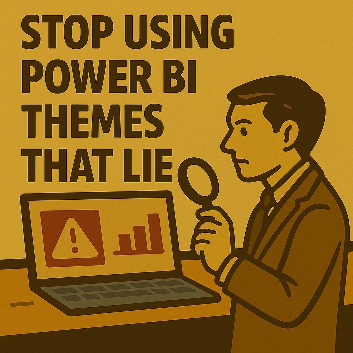
STOP Using Power BI Themes That Lie
Published 2 months, 2 weeks ago
Description
(00:00:00) The Power of Theme in Power BI
(00:00:00) The Hidden Dangers of Color Themes
(00:00:18) The Five Invisible Failures
(00:00:37) Contrast: The First Line of Defense
(00:01:11) The Four Laws of Contrast
(00:01:59) Redundancy: The Secret to Visibility
(00:02:23) The Containment Procedure for Alerts
(00:04:57) The Matrix Matrix: Subtotals in Disguise
(00:06:17) The Subtotal Containment Protocol
(00:09:40) Tooltips: The Hover Hazard
Most creators treat Power BI themes as “brand colors,” but those hues can bury alerts, erase subtotals, distort slicer states, and hide KPIs in plain sight.
This episode exposes five invisible theme failures and delivers a ruthless, pass/fail validation protocol to guarantee clarity, accuracy, and accessibility across any report. 1. The Accessibility Reactor — Contrast for Alerts Is Failing Your alerts aren’t “subtle”—they’re disappearing. Low contrast turns KPIs into decorative noise. Key Problems
- Alert colors fall below AA accessibility thresholds
- Background layers, images, and card tints distort perceived contrast
- Color-only alerts fail under glare, projection, or color vision deficiency
- Text/UI labels: 4.5:1 minimum
- Graphical marks (bars/lines): 3:1 minimum
- High-risk KPIs: Aim for 7:1
- Define alert colors inside theme JSON (positive/warning/danger)
- Validate exact pixel contrast using Color Contrast Analyzer or WebAIM
- Add redundancy: icons + labels + color
- Enforce no text under 4.5:1, ever
- Strengthen line/grid contrast so visuals remain readable in motion
- Equal weight and color between detail rows and subtotals
- Zebra striping or drill indents misleading the eye
- Totals disappearing at 80% zoom
- Explicitly style subtotal + total selectors in theme JSON
- Add background bands, stronger text weight, and a divider line
- Ensure totals meet 3:1 contrast (4.5:1 for grand totals)
- Right-align numbers, reduce noise, and clarify units
- Subtotals identifiable in <1 second at 80% zoom
- Divider visibly separates detail vs. aggregate
- No conditional formatting overriding subtotal visibility
- Header and value tones too faint
- Pane transparency letting chart noise bleed through
- Report page tooltips violating contrast rules
- Tooltip DAX slowing the interaction
- Set tooltip title/value/background styles in theme JSON
- Enforce 4.5:1 contrast on all tooltip text
- Use opaque backgrounds with visible shadows
- Keep tooltip content minimal and high-signal
- Optimize queries for sub-150ms rendering
- Legible over dense visuals
- Title/value hierarchy obvious in <0.5s
- No KPI name truncation
- No background noise leaking through
- Inconsistent font sizes across pages
- Labels and values using identical weight
- Poor contrast or ghost-gray labels
- Truncated numbers and wrapping text
- KPIs relying solely on color to indicate state
- Lock