Episode Details
Back to Episodes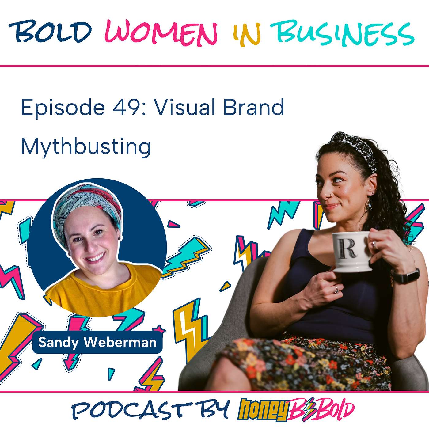
Episode 49: Visual Brand Mythbusting with Sandy Weberman
Description
✨Episode Summary
If you think branding is as simple as grabbing something cheap off of Fiverr or Canva, but the result just feels OFF, this episode is for you!
In this week’s episode, I talk with HoneyBeBold’s lead designer, Sandy Weberman, about what goes into creating a cohesive brand identity.
Together, we break down the difference between a quick DIY logo and a strategically built visual brand that tells your story before you say a word. From fonts that set the mood to white space that lets your message breathe, Sandy shares what really separates pretty graphics from a powerful brand system.
Whether you’re working with a designer or doing it yourself, you’ll learn:
- Why visuals that “don’t feel like you” usually signal a deeper strategy problem
- The real difference between a Fiverr logo and a strategic brand identity
- How typography quietly shapes emotion and brand perception
- Why white space isn’t “wasted” — it’s your best friend for focus and clarity
- How color psychology, contrast, and accessibility make or break your brand
- Ways to use photography and texture to make your visuals look authentic (even with stock photos 😉)
- Why consistency across platforms builds instant trust
If you’ve ever thought “I picked the wrong colors,” or “my logo doesn’t match my vibe,” grab your coffee and listen in — this episode will change how you see your brand visuals forever.
📌Resources & Links Mentioned
- Go give Sandy a follow on LinkedIn and Instagram
- Check out Sandy’s AMAZING work
- Color palette tools mentioned: Huemint, Adobe Color Contrast Checker
🔥Action Items
- Take the Content Marketing Power Type quiz to finally create content that feels like you
- Book your Bold Day of Content
Hosted by: Rachel Honeyman
Music by: Shmukulele
Produced by: HoneyBeBold
Boldly stalk us:
Website | Facebook | Instagram | LinkedIn | YouTube
Subscribe to the pod on your podcast platform of choice