Episode Details
Back to Episodes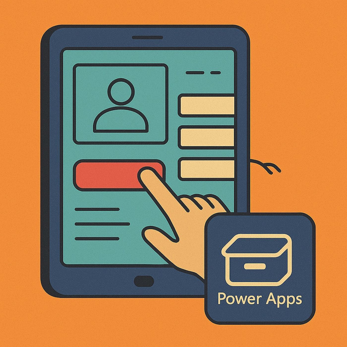
Power Apps UI containers: stop building ugly apps and use layout structure and components for responsive, on‑brand design
Season 1
Published 7 months, 3 weeks ago
Description
Power Apps UI containers: in this episode of M365.fm, Mirko Peters explains why most Power Apps look like chaotic prototypes—and how mastering containers and component libraries turns them into clean, responsive, on‑brand enterprise apps. He starts with the “pixel‑perfect hell” many makers live in: dragging buttons and labels by hand, patching layout with X/Y formulas, and watching everything break the moment someone opens the app on a phone instead of a laptop.
Mirko first diagnoses the structural problem. Without containers, every control is positioned in isolation, so each new label, logo, or field adds manual alignment debt. Slight design variations accumulate across screens and apps—different paddings, misaligned headers, and inconsistent colors—until the Power Apps landscape looks like twelve vendors fought over the brand guidelines. This is not just ugly; it is expensive to maintain and impossible to standardize.
He then introduces containers as the physics engine of layout. Vertical and horizontal containers define how elements relate to each other instead of locking them to fixed coordinates, giving you automatic stacking, alignment, padding, and gaps. Mirko walks through building a screen skeleton—header, content, footer, sidebars—purely with nested containers so the UI behaves like a modern responsive website: resize the window or switch device, and the layout adapts without a single X/Y formula.
From there, he tackles the mental shift. You trade “freehand” drag‑and‑drop for deliberate structure, naming containers like cnt_Header and cnt_Main and rearranging regions from the tree view instead of nudging pixels. It feels restrictive at first, but Mirko shows how this discipline pays off when marketing changes a logo or brand color and you update it once at container or component level, not on every screen. Layout integrity stops being a heroic effort and becomes a built‑in property of your apps.
Finally, the episode previews component libraries as the next step. Once containers give you reliable layout, component libraries give you reusable, branded building blocks—headers, navigation bars, buttons, and forms—that every app can share. Mirko explains how this combination lets IT and design define a governed design system while makers still build quickly, so Power Apps stop looking like side projects and start looking like one product family.
HAT YOU WILL LEARN
- Why most Power Apps UIs look inconsistent and are painful to maintain.
- How vertical and horizontal containers control layout, alignment, and responsiveness.
- How to build full screens with containers and no X/Y formulas.
- How naming and structuring containers make redesigns fast instead of fragile.
- Why containers are the foundation for using component libraries and proper design systems.
Listen Now
Love PodBriefly?
If you like Podbriefly.com, please consider donating to support the ongoing development.
Support Us