Episode Details
Back to Episodes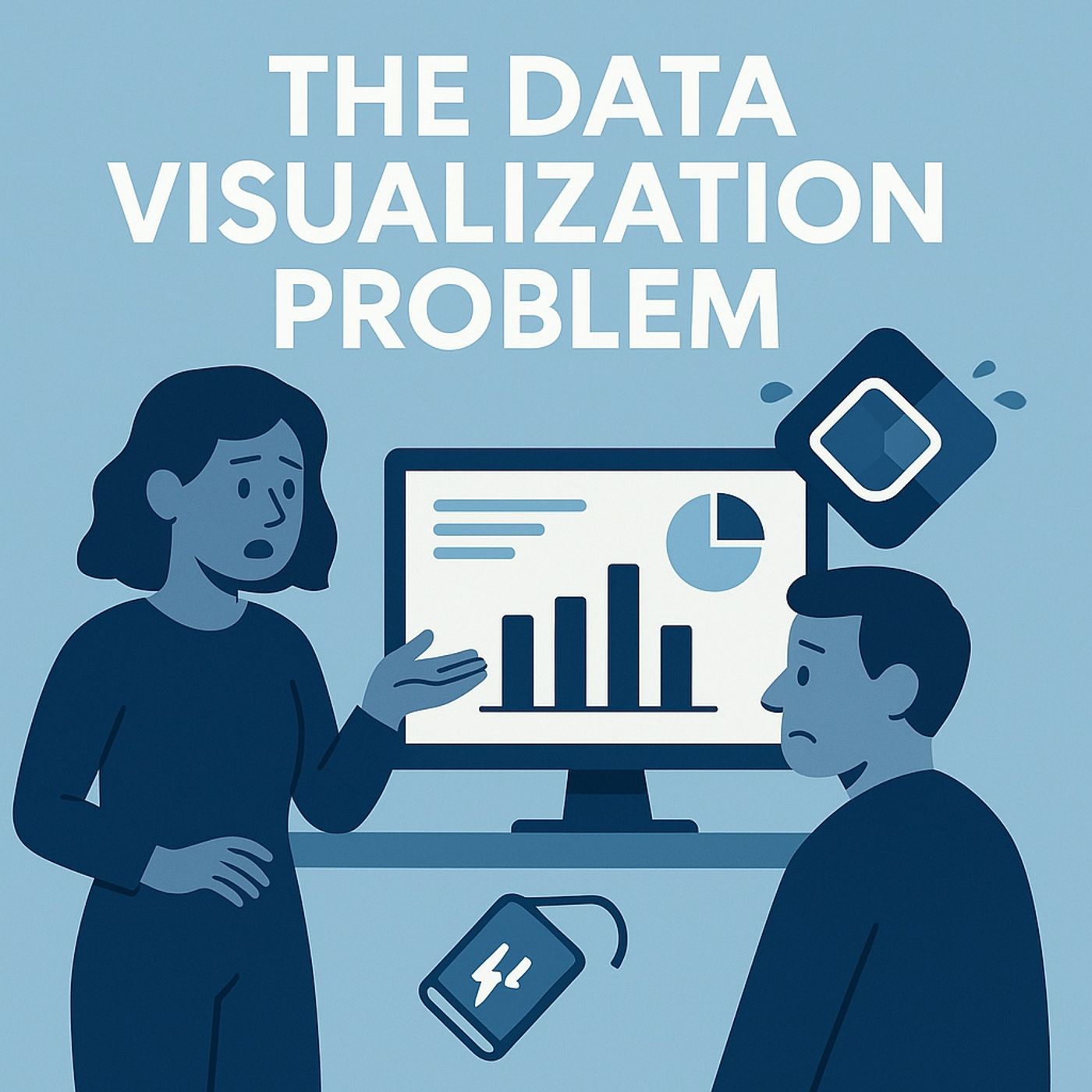
Why Power Apps charts are broken (and how AI fixes them)
Season 1
Published 7 months ago
Description
(00:00:00) The Power Apps Chart Conundrum
(00:01:25) The Broken Native Chart Control
(00:04:17) AI to the Rescue: A New Visualization Engine
(00:08:08) Building Your First AI Chart Module
(00:11:46) Dynamic and Context-Aware Charts
(00:16:35) The Future of Power Apps: 3D Visualizations
(00:19:51) The AI-Powered Visualization Revolution
In this episode of M365.fm, Mirko Peters explains why native Power Apps charts feel like they escaped from a 1990s Excel demo and why they fall apart the moment you need modern data visualization inside real apps. He unpacks how the built‑in chart control is architecturally rigid—locked templates, sealed rendering, no real styling or dynamic behaviour—so every attempt to change colors, fonts, axes, or interactions turns into brittle formulas and frustrating workarounds. You will learn why “30 million items” is a marketing number, how client‑side rendering, lack of extensibility, and archaic visual defaults turn charts into laminated screenshots instead of responsive, trustworthy visuals.
Mirko then introduces the AI‑driven alternative: using apiprompt.predict and Code Interpreter to generate charts for you on demand. He shows how to send lean JSON data from Power Apps to an AI model, let it generate chart code and render a modern image, and feed that back into an HTML control as a Base64 image—turning Power Apps into a flexible host while AI does the drawing. You’ll hear how to design precise prompts (chart type, colors, fonts, labels), keep payloads small for performance, and use Code Interpreter as your in‑app chart engine without custom connectors or third‑party packages.
The episode walks through building a reusable AI chart module: from shaping the prompt and collections, to handling different chart types (bar, line, lollipop, area), to wiring a “Generate chart” button that responds to filters and app context. Mirko explains how to move from demo mode to production: standardizing prompts, documenting patterns, adding loading states, and testing across data volumes so teams can drop the same module into multiple apps instead of reinventing chart logic every time. He also highlights failure modes—vague prompts, over‑large JSON, mismatched fonts—and how to iterate until AI‑rendered charts consistently match your brand and UX guidelines.
WHAT YOU WILL LEARN
The problem is not that Power Apps can’t show charts—it is that its native chart control was never built for modern visualization. By letting AI generate chart images from JSON and prompts, Power Apps becomes the frame and AI becomes the chartengine, giving you branded, flexible visuals without fighting
(00:01:25) The Broken Native Chart Control
(00:04:17) AI to the Rescue: A New Visualization Engine
(00:08:08) Building Your First AI Chart Module
(00:11:46) Dynamic and Context-Aware Charts
(00:16:35) The Future of Power Apps: 3D Visualizations
(00:19:51) The AI-Powered Visualization Revolution
In this episode of M365.fm, Mirko Peters explains why native Power Apps charts feel like they escaped from a 1990s Excel demo and why they fall apart the moment you need modern data visualization inside real apps. He unpacks how the built‑in chart control is architecturally rigid—locked templates, sealed rendering, no real styling or dynamic behaviour—so every attempt to change colors, fonts, axes, or interactions turns into brittle formulas and frustrating workarounds. You will learn why “30 million items” is a marketing number, how client‑side rendering, lack of extensibility, and archaic visual defaults turn charts into laminated screenshots instead of responsive, trustworthy visuals.
Mirko then introduces the AI‑driven alternative: using apiprompt.predict and Code Interpreter to generate charts for you on demand. He shows how to send lean JSON data from Power Apps to an AI model, let it generate chart code and render a modern image, and feed that back into an HTML control as a Base64 image—turning Power Apps into a flexible host while AI does the drawing. You’ll hear how to design precise prompts (chart type, colors, fonts, labels), keep payloads small for performance, and use Code Interpreter as your in‑app chart engine without custom connectors or third‑party packages.
The episode walks through building a reusable AI chart module: from shaping the prompt and collections, to handling different chart types (bar, line, lollipop, area), to wiring a “Generate chart” button that responds to filters and app context. Mirko explains how to move from demo mode to production: standardizing prompts, documenting patterns, adding loading states, and testing across data volumes so teams can drop the same module into multiple apps instead of reinventing chart logic every time. He also highlights failure modes—vague prompts, over‑large JSON, mismatched fonts—and how to iterate until AI‑rendered charts consistently match your brand and UX guidelines.
WHAT YOU WILL LEARN
- Why native Power Apps charts are architecturally limited and hard to style or extend.
- How to use apiprompt.predict and Code Interpreter as an AI chart engine inside your apps.
- How to send clean JSON from collections, design precise prompts, and render Base64 images in HTML controls.
- How to build a reusable AI chart module that supports multiple chart types across apps.
- How to avoid common pitfalls (payload size, vague prompts, inconsistent styling) when using aivisualization.
The problem is not that Power Apps can’t show charts—it is that its native chart control was never built for modern visualization. By letting AI generate chart images from JSON and prompts, Power Apps becomes the frame and AI becomes the chartengine, giving you branded, flexible visuals without fighting