Episode Details
Back to Episodes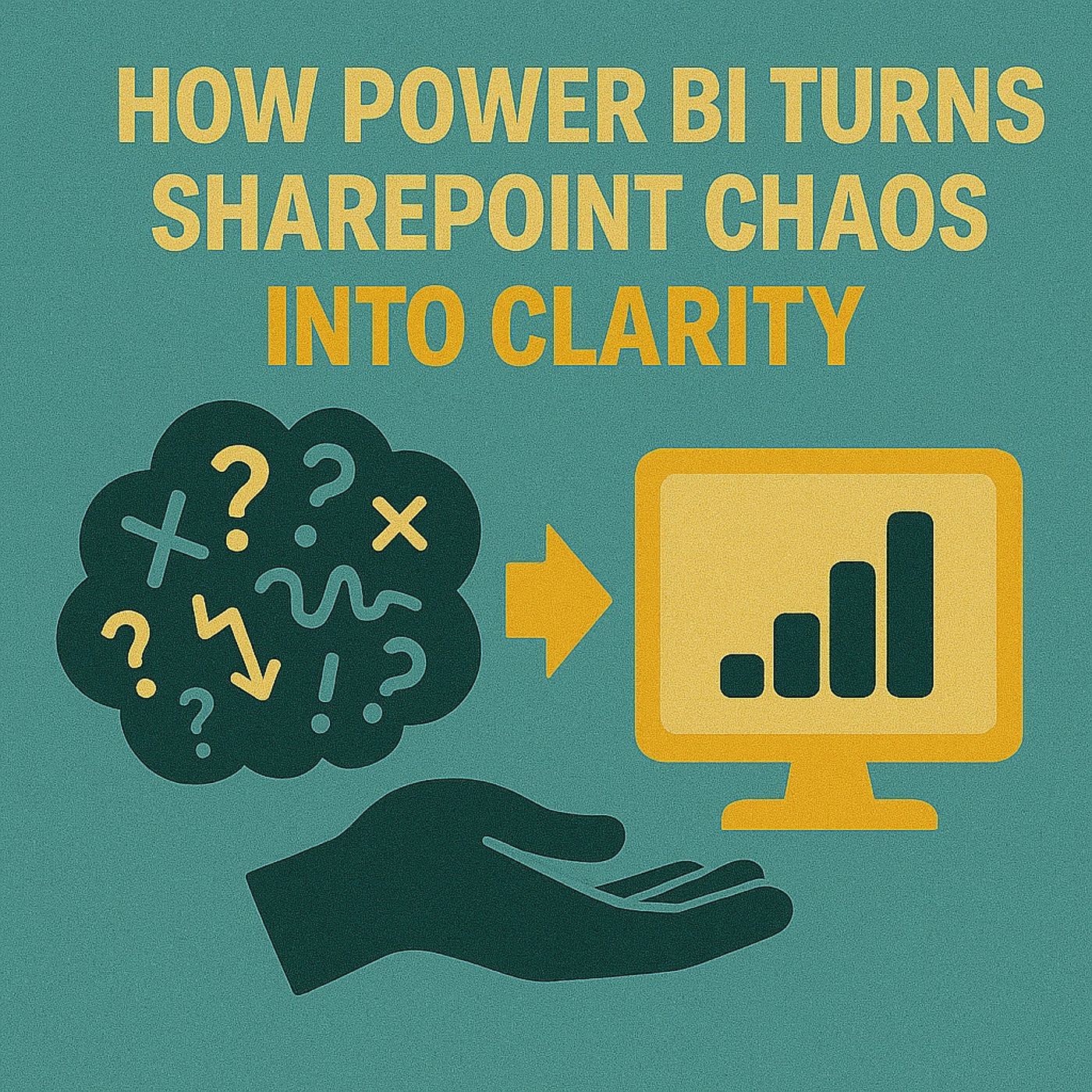
How Power BI Turns SharePoint Chaos Into Clarity
Published 5 months, 1 week ago
Description
Ever stared at a SharePoint list and thought, “Is this data actually trying to hurt me?” Rows and columns everywhere, and the only way you get anything out of it is by smashing Export to Excel for the 400th time. Here’s what we’re fixing today: first, how to connect SharePoint lists directly into Power BI, second, how to clean up the mess with Power Query, and third, how to publish and embed the finished report right back into SharePoint so users actually see it. And there’s one mistake people almost always make when starting that connection — we’ll get to that. But first, let’s talk about why SharePoint lists look fine on the surface… until you actually ask them a real question.Why SharePoint Lists Are Great… Until They Aren’tPicture this: you’re working with a SharePoint list that has a few hundred rows. At first glance, it looks harmless. Clean grid, tidy columns, the kind of thing that makes a manager think all is well. But the minute someone in a meeting asks, “Which projects are running late?” that calm grid suddenly feels like a trap. You start scrolling, filtering, messing with search boxes—and instead of insight, you end up wasting ten minutes hoping your filter didn’t cancel out the last one. Here’s the honest deal: SharePoint lists are great at one thing—collecting and storing stuff. Tasks, issues, milestones, risks… you can keep tossing rows and columns in, and it feels user-friendly enough. The problem shows up when you stop storing and start asking questions. That’s when the list stops being a neat tracker and starts feeling like a glorified spreadsheet bolted inside SharePoint with half the flexibility gone. And while Microsoft likes to call this “collaboration,” what it really means is multiple people squinting at the same endless grid and pretending that filter menus equal teamwork. Twenty-click filters aren’t collaboration—they’re punishment. It’s like inviting ten coworkers to share a filing cabinet and calling it innovative just because everyone’s jammed around the same drawer. The pattern is consistent: the data isn’t the issue. The navigation is. SharePoint’s grid interface was built for storage, not analysis. Finding actual answers is the digital version of walking through a basement of unlabeled boxes—you’ll dig, but you’re never entirely confident you found the right one. And since nobody has time for that, users fall back on the universal crutch: smashing “Export to Excel.” But here’s what really happens with that move—you just carried the mess into another room. Now you’re fighting with pivot tables, clumsy charts, and duplicated files. One person saves a version filtered by “Overdue,” another saves one filtered by “Project X,” and three days later nobody can agree which Excel file is “official.” Microsoft brags about modern teamwork, but what you’ve got instead is spreadsheet déjà vu from 2004, now trapped in Teams chat threads. So what exactly are the core problems with SharePoint lists for analysis? Three things keep coming back: filtering, trust, and scale. Filtering is slow and painful—you burn time just trying to slice the data. Trust takes a hit because once everyone exports to their own Excel copy, nobody knows which number is right anymore. And scale? That’s where things really collapse. A fifty-row list is fine. A two-thousand-row list feels like molasses: every click loads slow, filters choke, and the whole thing fights you. And while performance does technically depend on list thresholds, column types, and the browser setup, nobody in the middle of a deadline cares—the experience feels broken. That’s why people give up. It’s not that their data is bad—it’s that the view hides the story. A SharePoint list will happily let you store every line item your team ever dreamed up, but the minute you try to get meaning out of it, you’re left exporting, filtering, or arguing over accuracy. You don’t need more exports. You need a view that tells the story. And that’s the key point here—the problem i