Episode Details
Back to Episodes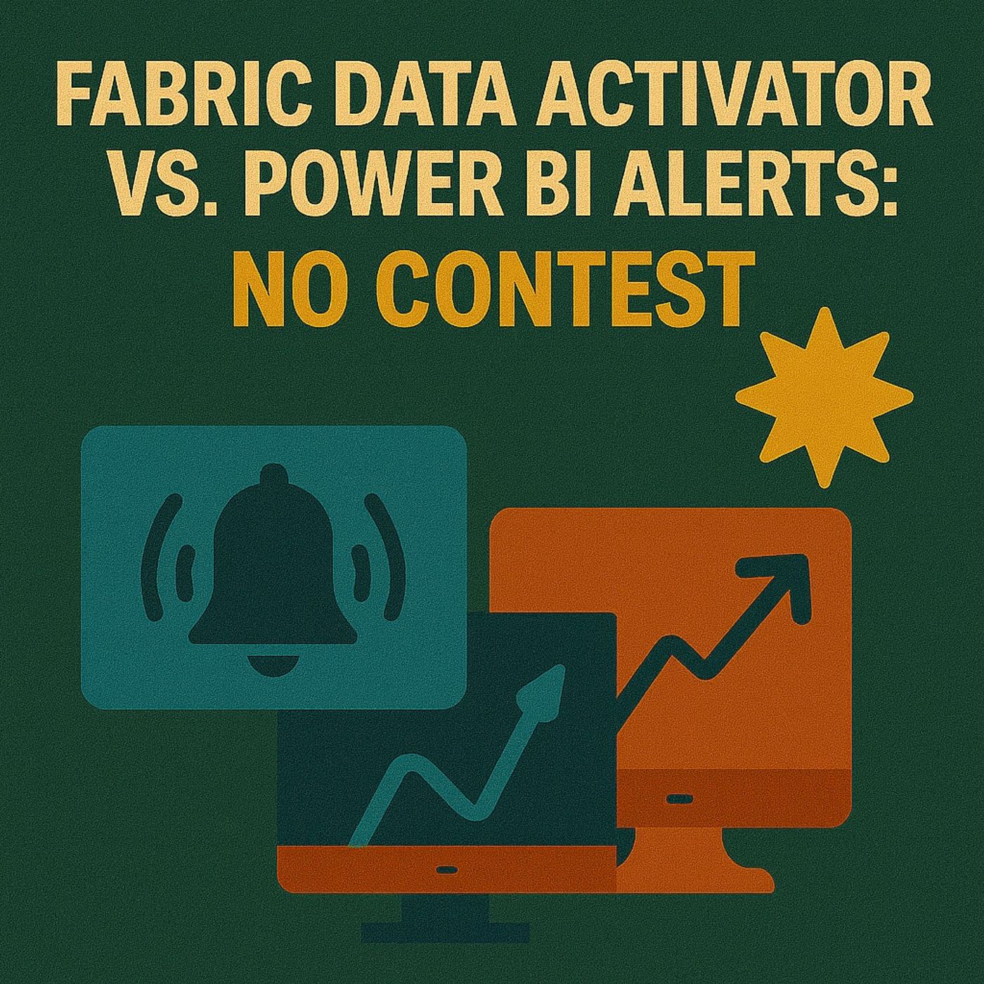
Fabric Data Activator vs Power BI Alerts: How To Escape Dashboard Prison, Kill Script Hacks & Build Real Monitoring
Season 1
Published 8 months, 2 weeks ago
Description
Power BI alerts feel like Clippy in 2025: “It looks like you’re trying to stay informed…” while forcing you to build dashboards you don’t want and card visuals nobody uses. In this episode, we start from that admin reality—alert fatigue, dashboard clutter, card‑only restrictions, and fragile PowerShell workarounds—and walk through why Fabric Data Activator is a fundamentally different model. Instead of pinning single numbers to graveyard dashboards, Data Activator sits directly on top of your Fabric events and datasets, watches the real signals (trends, thresholds, anomalies, schema changes), and triggers actions in the tools you already rely on. If you’re tired of building shrines just to get a simple ping when something important changes, this is the episode that shows you the way out.
THE DASHBOARD PRISON YOU NEVER ASKED FOR
We dig into what makes traditional Power BI alerts so painful: they only work on card visuals pinned to dashboards, which means every “simple” alert forces you to create a dedicated visual and a dashboard tile that exists only to keep the alert alive. Over time, that turns into a graveyard of forgotten dashboards, pinned cards, and mysterious tiles that no one wants to maintain—while still failing to cover real‑world needs like trend breaks, anomalies, or multi‑metric conditions. You’ll hear concrete examples—like needing a basic revenue threshold alert—and how quickly that expands into extra objects, governance sprawl, and confusion when someone opens yet another dashboard and asks, “Why does this even exist?” This is the core problem: the alert system forces you to build structure around its limits, instead of fitting into the way your teams actually work.
THE CARD VISUAL TRAP AND SCRIPT HANGOVER
On top of the dashboard prison, there’s the card visual trap: alerts only listen to flat one‑number tiles, not to the charts, KPIs, and anomaly visuals where the real insight lives. That means you end up fabricating “alert cards” that collapse rich trends into a single static value, just so the system will fire, and then spend months remembering which card powers which notification. When that breaks down, most teams reach for PowerShell and custom scripts: duct‑tape jobs that poll APIs, send emails, and push Teams messages until a schema change, type mismatch, or failed run turns the whole setup into alert storms or silent failures. We talk openly about this script hangover—how “flexibility” becomes unmaintainable glue logic—and why you shouldn’t need a pile of brittle scripts just to know that something important changed in your data.
WHAT DATA ACTIVATOR CHANGES
Data Activator flips the model by watching events and data directly in Fabric instead of clinging to pinned tiles. You define patterns that matter—thresholds, spikes, drops, inactivity, schema drift—on top of your real event streams and tables, then route reactions into Teams, email, Power Automate, or downstream systems without building fake dashboards. Because it’s event‑ and rule‑driven, you can monitor context (like changes over time, combinations of conditions, or specific entities) in a way card alerts simply can’t express. In the episode, we walk through practical scenarios where admins replace dashboard alerts and custom scripts with Data Activator patterns, and how this reduces clutter, improves reliability,