Episode Details
Back to Episodes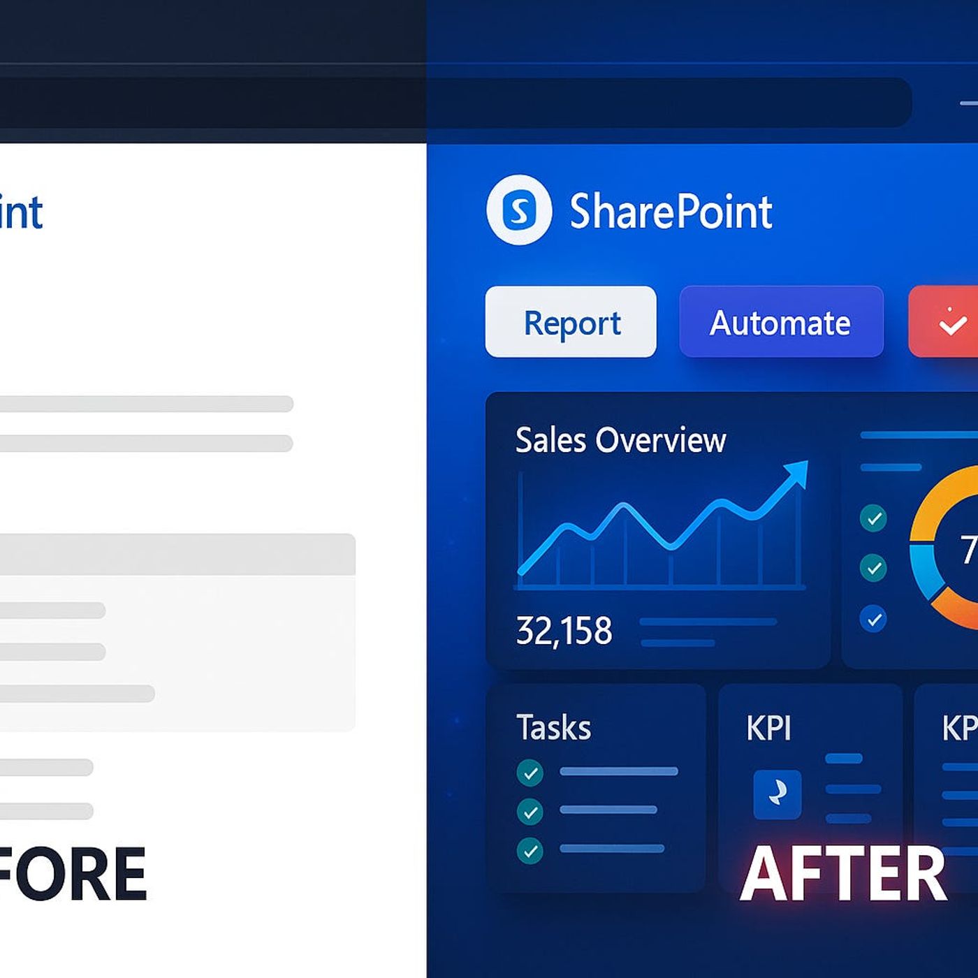
Modern SharePoint Pages Done Wrong—Are You Guilty?
Published 7 months ago
Description
Your SharePoint page looks modern, but here’s what most admins don’t realize: those default layouts and buttons might be blocking your next workflow breakthrough. It’s not about fancier graphics—it’s about getting the right data, in the right hands, at the right moment.We’re unpacking the subtle design mistakes that kill productivity, and the advanced fixes that even Microsoft’s templates don’t mention.Design Traps: Why Most SharePoint Pages Stall ProgressIf you’ve worked with SharePoint for more than a week, you’ve probably seen this: a shiny, modern page that promises progress but somehow feels just as clunky as the classic version you replaced. Everything looks cleaner, brighter, and a bit more “Microsofty,” but after the first login, people start drifting away. So why does a platform built to drive collaboration so often leave teams lost, clicking through an endless loop of lists, libraries, and menu bars? The short answer is: just because it’s “modern” on the surface doesn’t mean it actually works for real business needs underneath. Let’s zoom in on how this plays out day to day.A typical SharePoint journey goes like this. Someone on IT—or maybe even a keen business user—unlocks Modern Pages after years on classic. There’s buzz in the hallway about new templates, better mobile support, and those snappy web parts. Overnight, your intranet homepage turns from a wall of blue links into something that looks like a news portal. Announcements in bright tiles. Hero web parts with cute icon overlays. You get pats on the back for finally making something that “looks like 2024.” But within two months, complaints start. Stats are out of date. No one knows what’s actually urgent. The site’s prettier, but it hasn’t solved anything old SharePoint struggled with—except now it’s hiding it behind gradients and whitespace.Here’s the real impact that shows up quietly. Productivity tanks. Teams used to go to SharePoint when they needed to see what was happening—now, they open it, don’t see answers or triggers, and bounce out. You’ll hear things like “We put that on the SharePoint,” but then someone follows up with “Did you check the email?” or “Let me just export this to Excel and mail it around.” The site itself sits in the background, collecting project docs nobody opens twice. Real workflows keep happening by email or, worse, in rogue Teams chats nobody can trace later.Picture a project status page someone set up with a modern list and a calendar. The interface looks fine on desktop, but overdue tasks use the same color as new ones, there’s no way to flag things visually, and you can’t trigger a workflow right from the view. The analytics everyone actually wants—for example, how many tasks have slipped this week, or which team members are overloaded—are buried in a Power BI report that takes three separate clicks to open. Over time, that friction adds up. Instead of one glance to see what’s at risk, someone spends half their Monday piecing together updates from three locations. Nothing about that feels modern.Now, Microsoft’s own research has called this out. They found users start ignoring SharePoint pages that don’t show actionable items or surface what really matters. If a homepage looks nice but doesn’t let you act—like assigning a task or flagging a delay—people move on. It’s a classic case of design missing the point. Modern layouts try to streamline what you see, but out of the box, they almost always limit what you can actually act on. Most web part templates surface static lists, announcements, or image carousels, but if you try to show live business data or trigger a Power Automate flow somewhere, you hit a wall quickly.What’s the business cost here? It’s not just grumbling in the halls. Delays creep in because teams aren’t nudged to act at the right time. Missed deadlines happen because someone thought an alert would show up on the homepage, but it didn’t. Every cycle, people revert back to their habits: downloading the latest